An introduction to data visualization
A top-down introduction to the basic concepts of data visualization. Layers, aesthetics and geometric objects. Coloring. Scatter plots. Bars, histograms, and density plots. Box plots.
1 A Jump Start
- We use a prepared dataset to directly skip to the visualization part.
A Jump Start
- In
R, datasets are stored as data frames. A data frame is a rectangular arrangement of data. The columns correspond to data variables, and the rows correspond to observations. - In this example, we use an enhanced type of data frame called a tibble. Tibbles are a modern re-implementation of data frames that comes with the
tidyverseecosystem.
A Jump Start
- The
eu_ictdata frame contains GDP values and occupation percentages in the ICT sector in 32 EU and non-EU countries for the year 2023.
A Jump Start
- A variable (column in the data frame) is a characteristic of an object or entity that can be measured.
A Jump Start
- An observation (row in the data frame) is a set of measurements for an object or entity collected under similar conditions.
A Jump Start
- A value (cell in the data frame) is an instance of a variable for a particular observation.
2 A first scatter plot
- We use
ggplot2to visualize the data. - The
ggplot2package is a flexible plotting system forRbased on the grammar of graphics.
2.1 An empty canvas
- We start by creating an empty canvas for the visualization.
2.2 Adding Axes
- We specify the axes via the
mappingargument. - Defining the mapping uses the
aes()function. - The
aesstands for aesthetics.
Adding Axes
- The
aesstands for aesthetics.
- Aesthetics are visual properties (lines, curves, shapes, colors, etc.) of the visualization.
Adding Axes
- The
aesstands for aesthetics.
- The
xandyarguments specify the variables to be plotted on the horizontal and vertical axes, respectively.
Adding Axes
Adding Axes
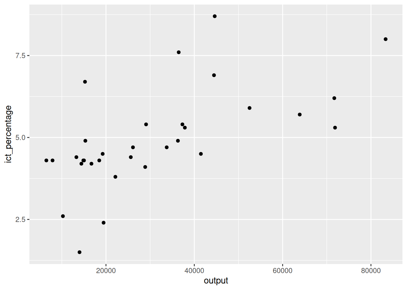
2.3 Adding a layer
- We aim to add a scatter plot on the canvas.
- Doing so requires adding a layer to the canvas.
- Adding a layer is done via the
+operator.
Adding a layer
- We aim to add a scatter plot on the canvas.
- This code snippet, however, is incomplete.
Adding a layer
- We aim to add a scatter plot on the canvas.
- Executing it in an
Rterminal changes the prompt from>to+.
- This indicates that the
Rinterpreter is waiting for more input.
2.4 Adding a scatter plot
- We aim to add a scatter plot on the canvas.
- We use the
geom_point()function to add a scatter plot. - There are many functions in
ggplot2, starting withgeom_, that add different types of layers. - For example,
geom_line(),geom_bar(),geom_boxplot(), etc.
Adding a scatter plot
- We aim to add a scatter plot on the canvas.
- We use the
geom_point()function to add a scatter plot.
- The
geomprefix stands for geometric object.
- A geometric object is a visual representation of (a subset of) the data.
Adding a scatter plot
- We aim to add a scatter plot on the canvas.
- We use the
geom_point()function to add a scatter plot. - The
geomprefix stands for geometric object.
- The
pointsuffix specifies we want to represent the data as points.
Adding a scatter plot
- We aim to add a scatter plot on the canvas.
- We use the
geom_point()function to add a scatter plot.
- The pattern is similar for other functions in the
geom_family.
- For example,
geom_linegives geometric representations of the data as lines.
Adding a scatter plot
- We aim to add a scatter plot on the canvas.
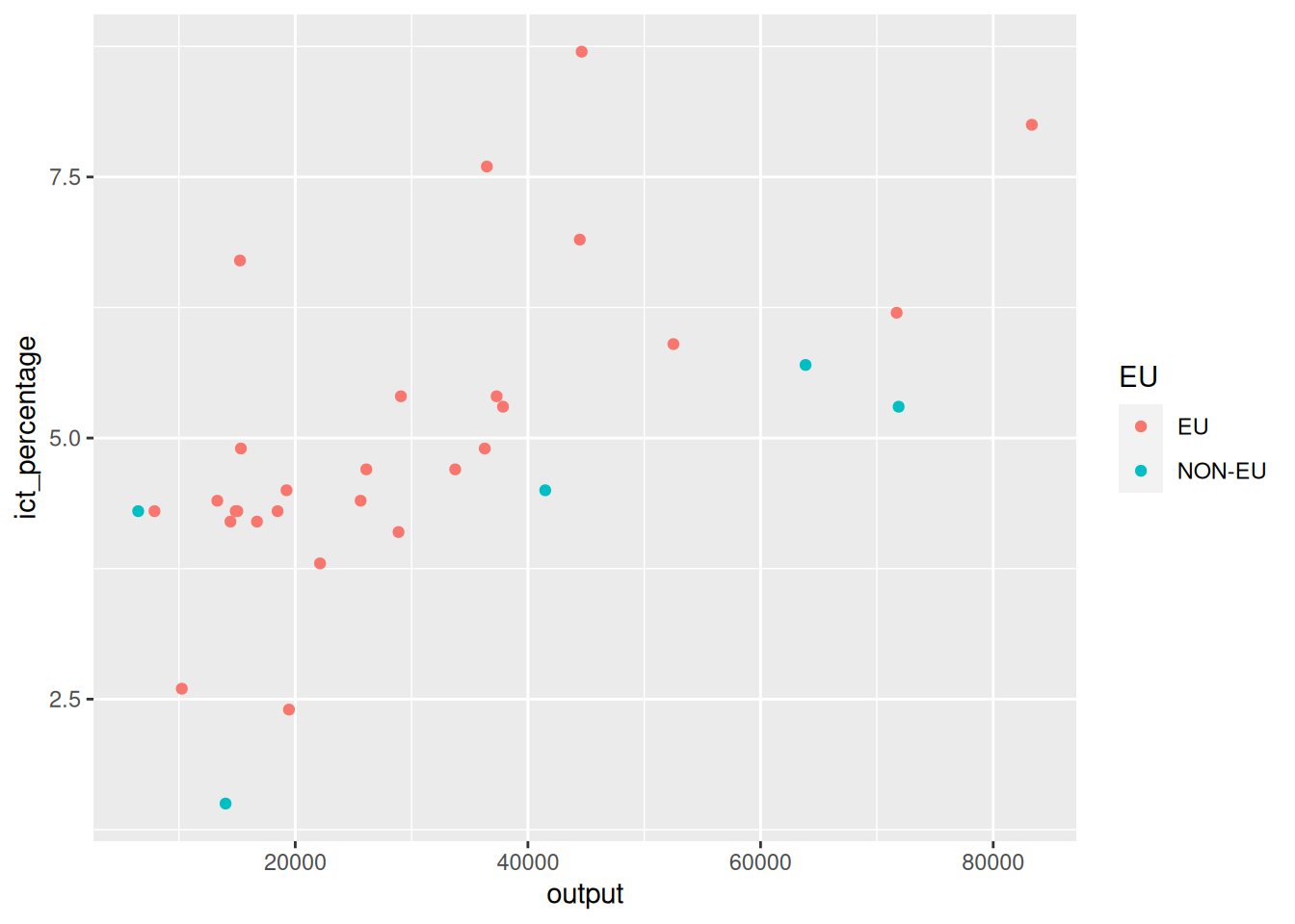
2.5 Coloring
- We aim to colorize the points based on the EU membership.
- The
EUvariable of theeu_ictdata frame is a categorical variable.
2.6 Programming digression: factor variables
- The
EUvariable of theeu_ictdata frame is a categorical variable.
- Categorical variables in
Rare stored as factors.
Programming digression: factor variables
- The
EUvariable of theeu_ictdata frame is a categorical variable.
- Categorical variables in
Rare stored as factors.
Programming digression: factor variables
- The
EUvariable of theeu_ictdata frame is a categorical variable.
- Categorical variables in
Rare stored as factors.
- Factor variables have levels that represent the different categories.
- The
EUfactor variable has two levels:EUandnon-EU. - We can colorize the points based on these levels.
Coloring the points
- We aim to colorize the points based on the EU membership.
2.7 Adding curves
- We aim to add linearly fitted lines to the scatter plot.
- We add another layer using the
+operator. - We use
geom_smoothto add fitted lines.
Adding curves
- We aim to add linearly fitted lines to the scatter plot.
- We use
geom_smoothto add fitted lines.
- The
geom_smoothcan be used for adding different types of fitted lines.
- The
methodargument specifies the type of the fitted line. - In this case, we use
method = "lm"for linear (model) fitted line.
Adding curves
- We aim to add linearly fitted lines to the scatter plot.
2.8 Adding a single curve
- We aim to add a single linearly fitted line to the scatter plot.
`geom_smooth()` using formula = 'y ~ x'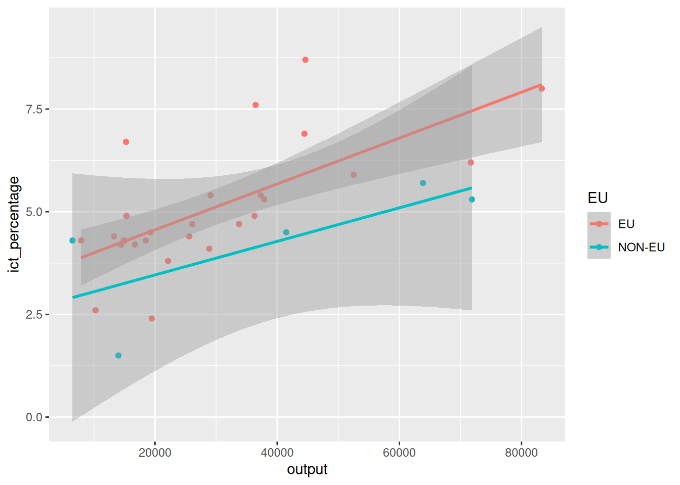
- The last code chunk respected the coloring aesthetics we defined earlier.
- What if we want to add a single fitted line to the scatter plot?
Adding a single curve
- We aim to add a single linearly fitted line to the scatter plot.
- Aesthetics need not be defined globally for all layers.
- We can define them locally for each layer.
- We can use
aes()to define aesthetics for each geometric object.
Adding a single curve
- We aim to add a single linearly fitted line to the scatter plot.
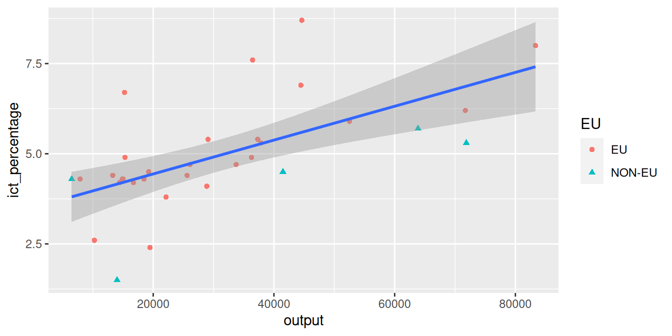
2.9 Adding shape aesthetics
- We aim to reshape point markers based on a categorical variable.
`geom_smooth()` using formula = 'y ~ x'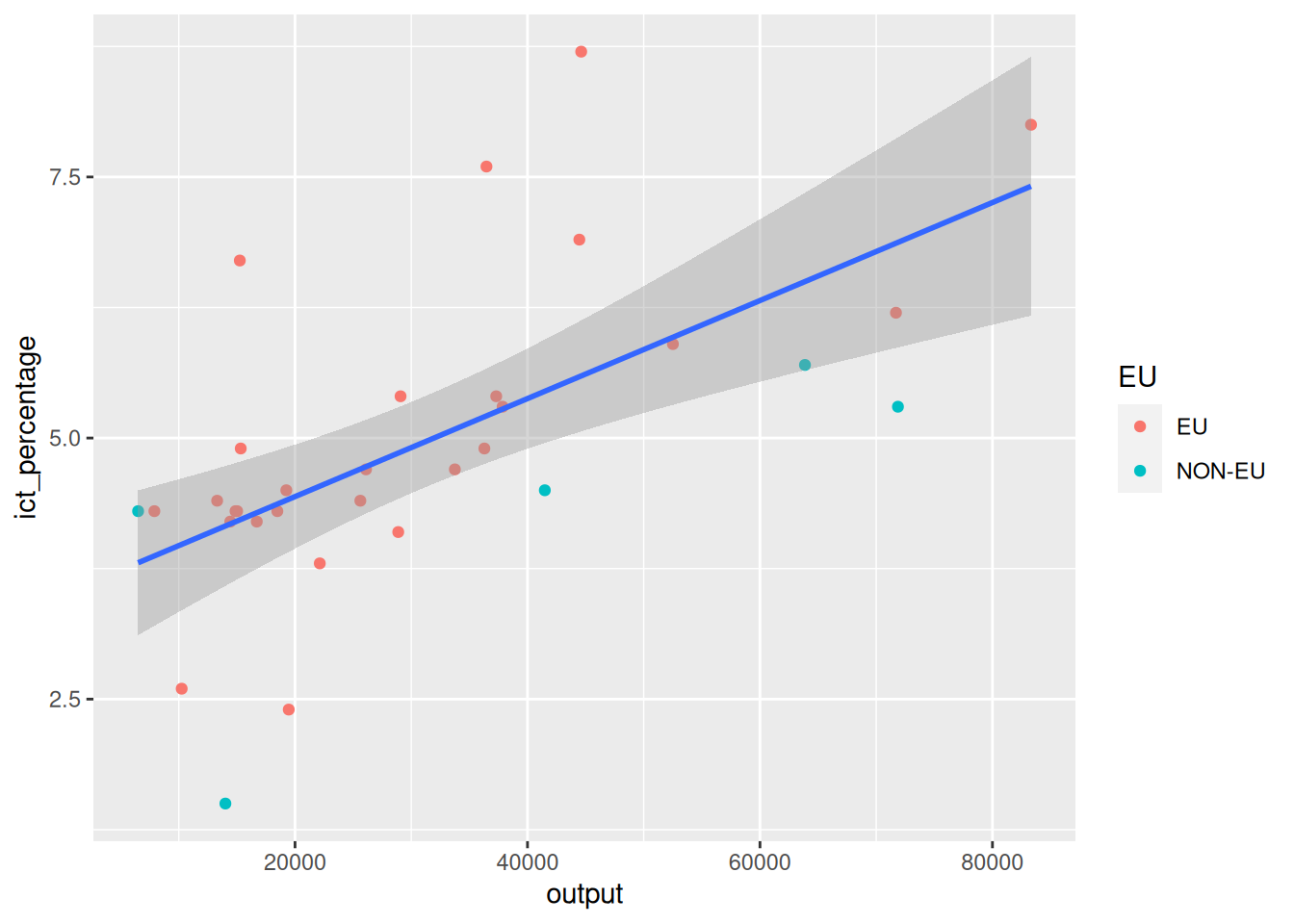
- On some occasions, differentiating points based on colors might not be enough (e.g., printing in black and white).
Adding shape aesthetics
- We aim to reshape point markers based on a categorical variable.
`geom_smooth()` using formula = 'y ~ x'
- Instead, we can use different shapes to represent different categories.
- Or, we can combine both color and shape aesthetics.
Adding shape aesthetics
- We aim to reshape point markers based on a categorical variable.
Adding shape aesthetics
- We aim to reshape point markers based on a categorical variable.
2.10 Adding titles and labels
- We aim to display some text information on the plot.
ggplot(
  data = eu_ict,
  mapping = aes(x = output, y = ict_percentage)
) +
geom_point(mapping = aes(color = EU, shape = EU)) +
geom_smooth(method = "lm") +
labs(
title = "ICT employment and Output",
subtitle = "EU27 vs. non-EU27 countries",
x = "Output per capita (EUR)",
y = "ICT employment (percentage of total employment)",
color = "Membership",
shape = "Membership"
)- We use the
labs()function to add titles and labels. - We can additionally modify the legend via
labs().
Adding titles and labels
- We aim to display some text information on the plot.
ggplot(
  data = eu_ict,
  mapping = aes(x = output, y = ict_percentage)
) +
geom_point(mapping = aes(color = EU, shape = EU)) +
geom_smooth(method = "lm") +
labs(
title = "ICT employment and Output",
subtitle = "EU27 vs. non-EU27 countries",
x = "Output per capita (EUR)",
y = "ICT employment (percentage of total employment)",
color = "Membership",
shape = "Membership"
)`geom_smooth()` using formula = 'y ~ x'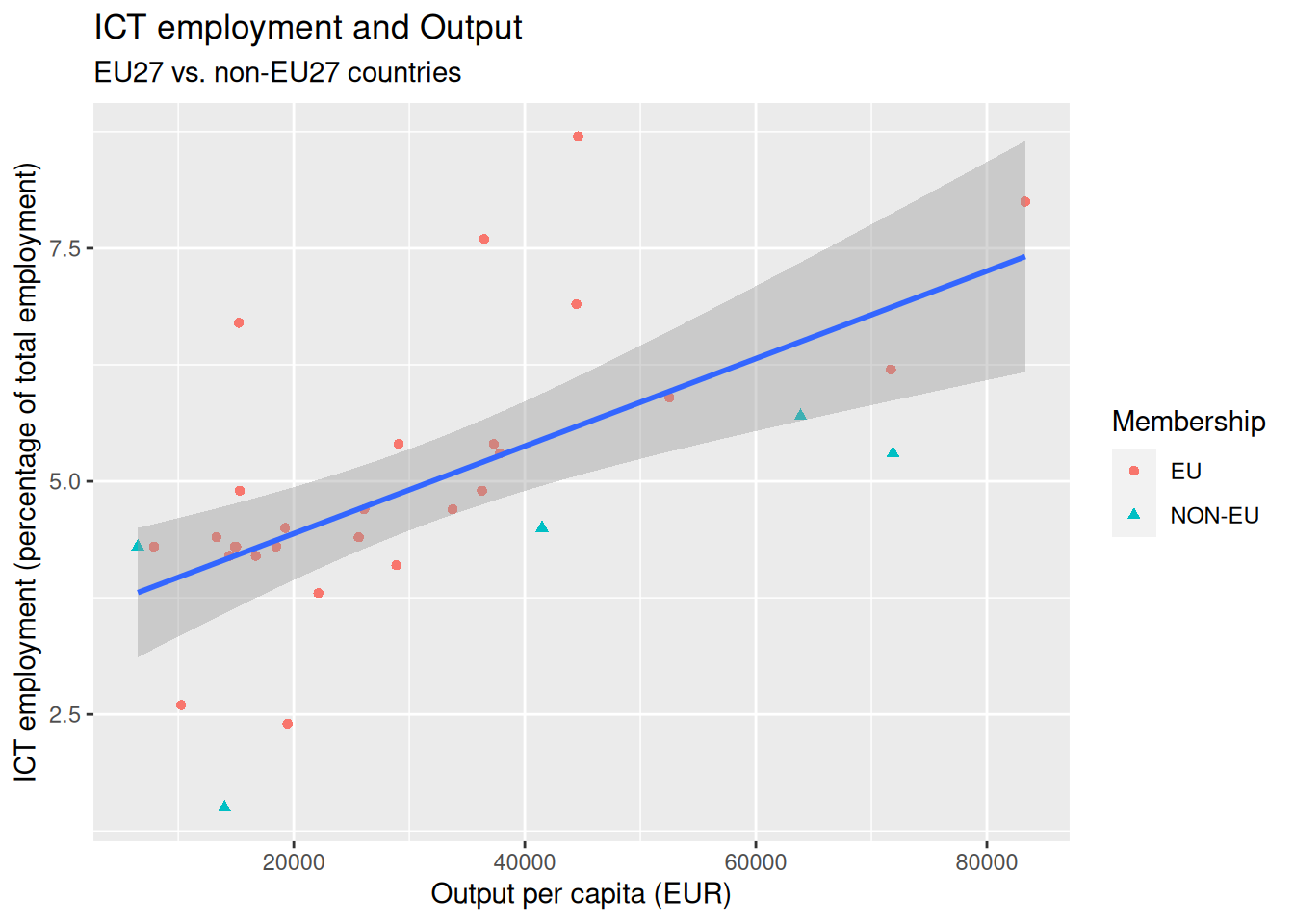
2.11 Color scaling
- We aim to recolor the figure in grayscale.
ggplot(
  data = eu_ict,
  mapping = aes(x = output, y = ict_percentage)
) +
geom_point(mapping = aes(color = EU, shape = EU)) +
geom_smooth(method = "lm") +
labs(
title = "ICT employment and Output",
subtitle = "EU27 vs. non-EU27 countries",
x = "Output per capita (EUR)",
y = "ICT employment (percentage of total employment)",
color = "Membership",
shape = "Membership"
) +
scale_color_grey()- We can use the
scale_color_grey()function.
- There are other color scaling functions available, such as
scale_color_brewer(),scale_color_continuous(),scale_color_colorblind(), etc.
Color scaling
- We aim to recolor the figure in grayscale.
ggplot(
  data = eu_ict,
  mapping = aes(x = output, y = ict_percentage)
) +
geom_point(mapping = aes(color = EU, shape = EU)) +
geom_smooth(method = "lm") +
labs(
title = "ICT employment and Output",
subtitle = "EU27 vs. non-EU27 countries",
x = "Output per capita (EUR)",
y = "ICT employment (percentage of total employment)",
color = "Membership",
shape = "Membership"
) +
scale_color_grey()`geom_smooth()` using formula = 'y ~ x'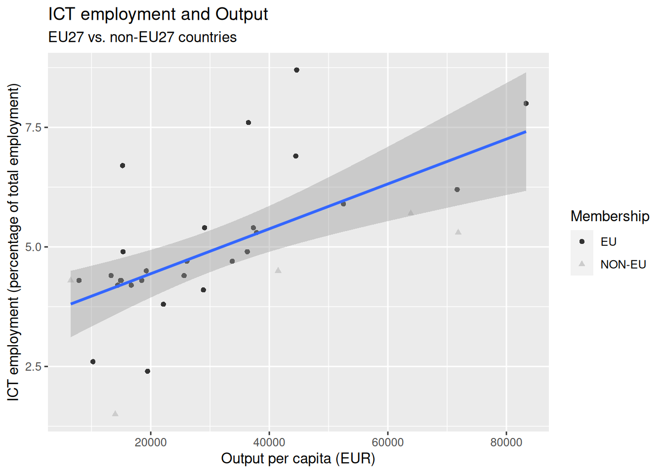
- The
scale_color_grey()function did not recolor the fitted line (why?). - We can manually set the color of the fitted line.
Color scaling
- We aim to recolor the figure in grayscale.
ggplot(
  data = eu_ict,
  mapping = aes(x = output, y = ict_percentage)
) +
  geom_point(mapping = aes(color = EU, shape = EU)) +
  geom_smooth(method = "lm", color = "darkgray") +
  labs(
    title = "ICT employment and Output",
    subtitle = "EU27 vs. non-EU27 countries",
    x = "Output per capita (EUR)",
    y = "ICT employment (percentage of total employment)",
    color = "Membership",
    shape = "Membership"
  ) +
  scale_color_grey()
`geom_smooth()` using formula = 'y ~ x'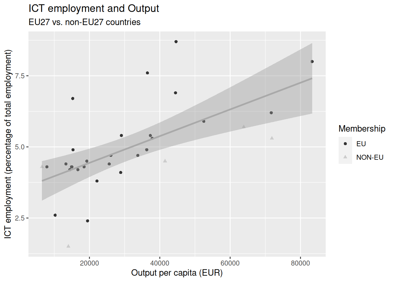
3 Visualizing empirical distributions
- We can visualize the empirical distribution of variables using histograms, bar plots, and density plots.
3.1 Visualizing empirical distributions discretely
- We can visualize the empirical distribution of variables using histograms, bar plots, and density plots.
- Histograms and bar plots visualize empirical distributions as a series of bars.
- Each bar represents a bin of data points.
- The height of the bar represents the frequency of the data points in the corresponding bin.
3.2 Visualizing empirical distributions continuously
- We can visualize the empirical distribution of variables using histograms, bar plots, and density plots.
- Density plots visualize empirical distributions as a continuous curve.
- The curve is an estimate of the population’s probability density function from which the sample was drawn.
3.3 Bars or densities?
- We can visualize the empirical distribution of variables using histograms, bar plots, and density plots.
- Bars can be used with both continuous (histogram) and categorical (bar plot) variables.
- Density plots are more suitable for continuous variables.
3.4 A first bar plot
- We wish to create a bar plot of the
incomevariable in theeu_ictdataset.
A first bar plot
- We wish to create a bar plot of the
incomevariable in theeu_ictdataset.
- We inform
ggplot2that we want to use theincomeusingaes().
- Since we only use one variable in the bar plot, we do not need to specify both the
xandyaesthetics.
A first bar plot
- We wish to create a bar plot of the
incomevariable in theeu_ictdataset.
- We inform
ggplot2that we wish to create a bar plot using thegeom_bar()function.
A first bar plot
- We wish to create a bar plot of the
incomevariable in theeu_ictdataset.
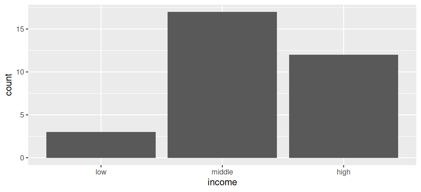
- The
incomevariable is categorical and has three levels:low,middle, andhigh.
- The levels are depicted on the axis used in the
aes()call.
- The other axis depicts the number of observations in each level.
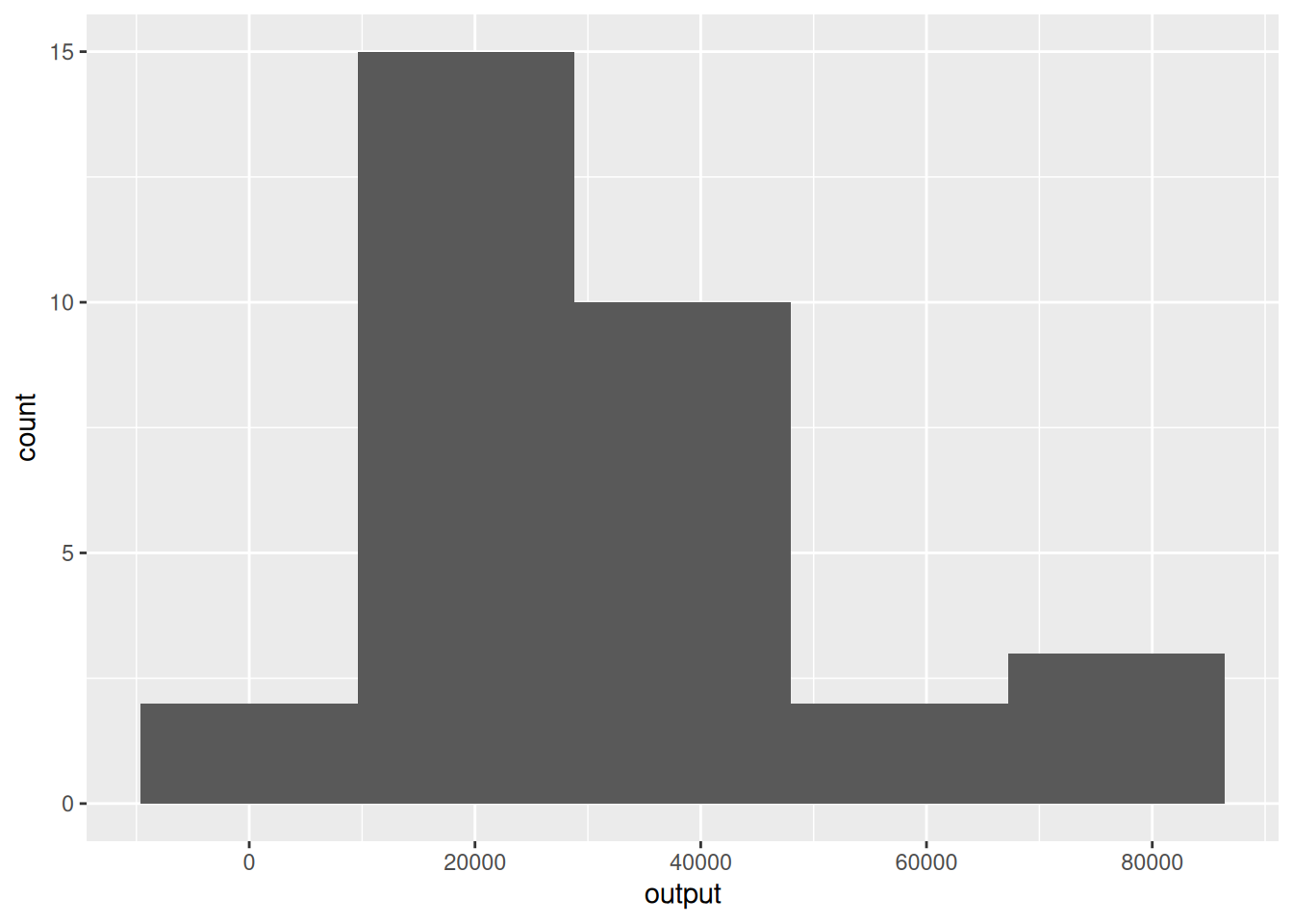
3.5 Histograms of continuous variables
- We aim to create a histogram of the (continuous)
outputvariable.
- We use the function
geom_histogram()to create a histogram of a continuous variable.
Histograms of continuous variables
- We aim to create a histogram of the (continuous)
outputvariable.
`stat_bin()` using `bins = 30`. Pick better value `binwidth`.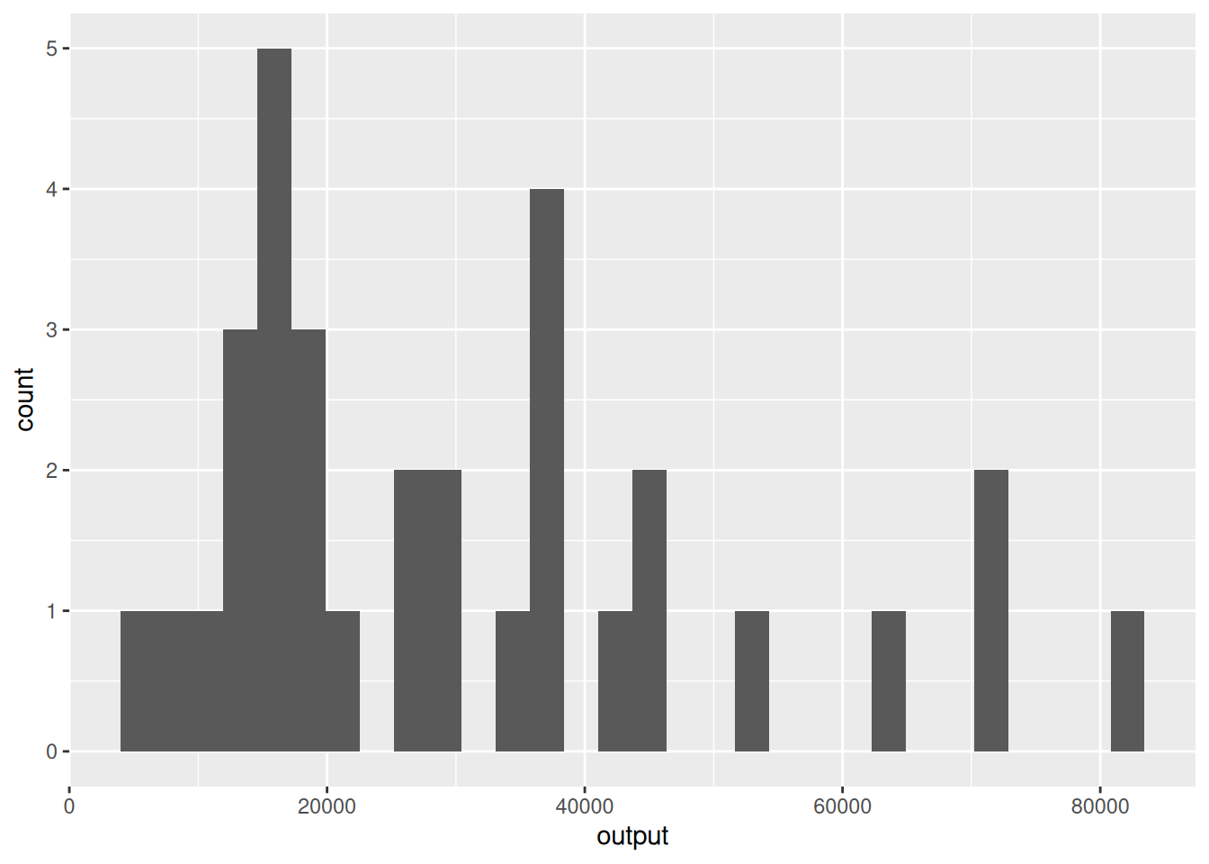
- In contrast to categorical variables, for which the number of bins is determined by the number of levels, histograms of continuous variables can be created with different numbers of bins.
Histograms of continuous variables
- We aim to create a histogram of the (continuous)
outputvariable.
`stat_bin()` using `bins = 30`. Pick better value `binwidth`.
- By default, the
geom_histogram()function uses 30 bins.
- This might not be what we want.
Histograms of continuous variables
- We aim to create a histogram of the (continuous)
outputvariable.
- We can use the
binsargument of thegeom_histogram()function to change the default behavior.
Histograms of continuous variables
- We aim to create a histogram of the (continuous)
outputvariable.
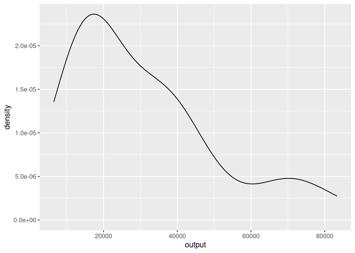
3.6 Density plots
- An alternative way to visualize the distribution of a continuous variable is to use a density plot.
- We use the function
geom_density()to create a density plot.
Density plots
- An alternative way to visualize the distribution of a continuous variable is to use a density plot.
Density plots
`stat_bin()` using `bins = 30`. Pick better value `binwidth`.
- Unlike the histogram case, the vertical axis of the density plot does not measure frequencies of observations.
- Very roughly, one can think of the density plots as having smoothed-out values of the number of observations over bins with tiny widths.
- These values can be greater or smaller than 1.
3.7 Ordering bar plots levels
- The bar plot of the
incomevariable we created earlier displays the levels in the order they appear in the data.
- In some cases, we may want to have bins ordered by their frequency.
Ordering bar plots levels
- We can change the order in which the levels are displayed using the function
fct_infreq.
- The
fct_infreqfunction reorders the levels of a factor based on their frequency. - Other options are
fct_inorder, which orders levels in the order they appear in the data, andfct_inseq, which orders levels by the numeric value of their levels. - The
fct_family of functions is part of theforcatspackage (part of thetidyverse).
Ordering bar plots levels
- We need to load the
forcatspackage to use these functions.
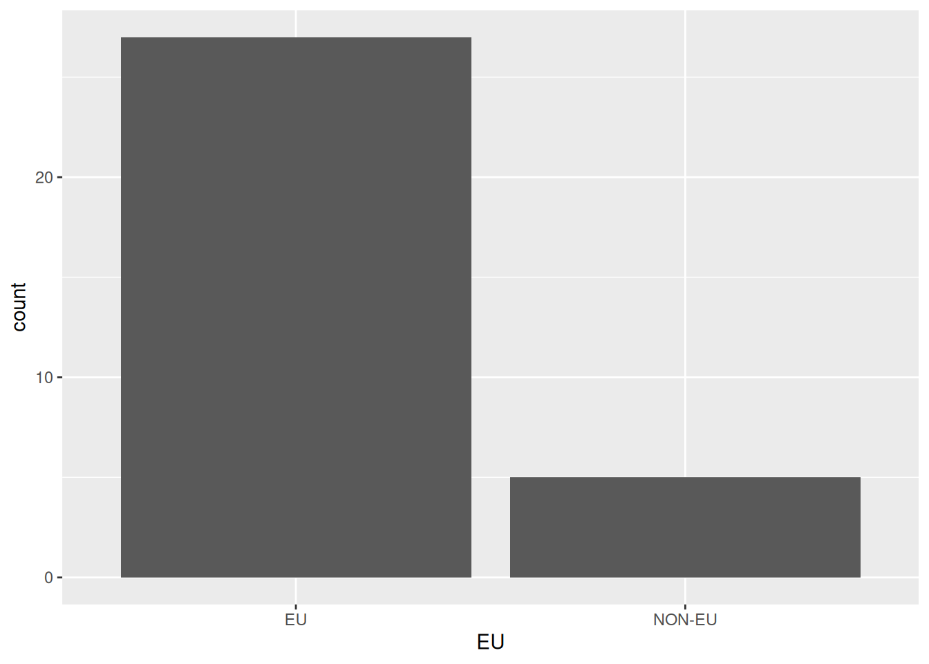
3.8 Coloring bar plots
- Let us plot the distribution of
incomelevels byeucountries in theeu_ictdataset.
- How can we achieve this?
- Creating a bar plot with the
EUcategorical variable does not provideincomeinformation.
Coloring bar plots
- Let us plot the distribution of
incomelevels byeucountries in theeu_ictdataset.
Coloring bar plots
- Let us plot the distribution of
incomelevels byeucountries in theeu_ictdataset.
- We can ask
ggplot2to color the bars by theincomevariable.
Coloring bar plots
- Let us plot the distribution of
incomelevels byeucountries in theeu_ictdataset.
- Setting the
fillaesthetic toincomewill color each bar according to the number of countries in eachincomelevel.
Coloring bar plots
- Let us plot the distribution of
incomelevels byeucountries in theeu_ictdataset.
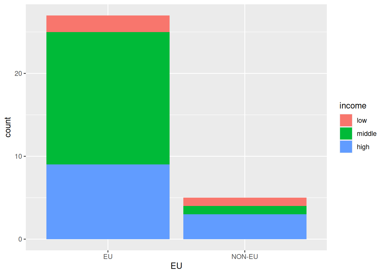
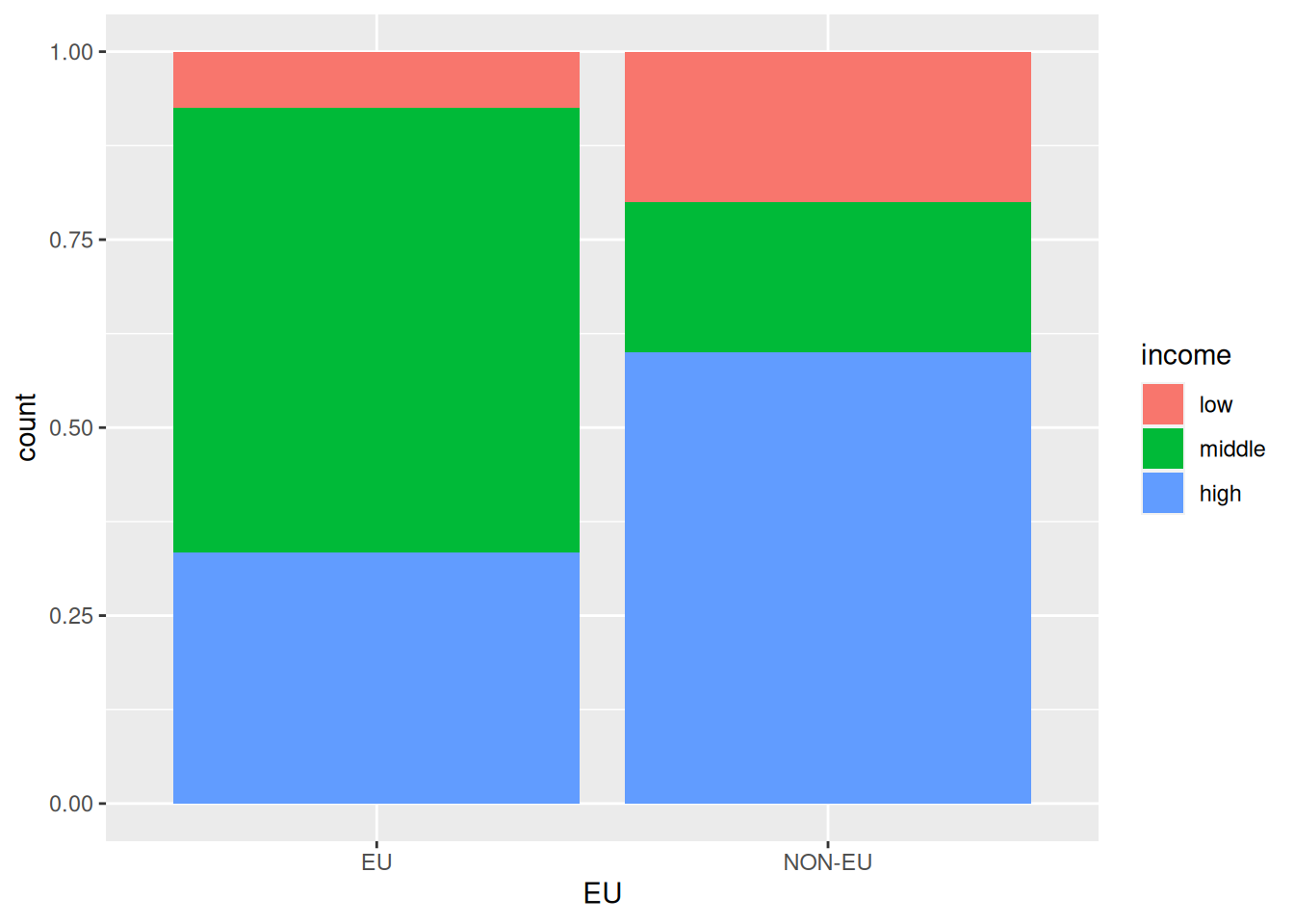
Coloring bar plots
- Let us plot the distribution of
incomelevel shares byeucountries in theeu_ictdataset.
- One issue with the last plot is that splitting countries based on
EUmembership is very unbalanced.
Coloring bar plots
- Let us plot the distribution of
incomelevel shares byeucountries in theeu_ictdataset.
- There are many more
EUcountries thanNON-EUcountries in the dataset, making comparisons challenging.
Coloring bar plots
- Let us plot the distribution of
incomelevel shares byeucountries in theeu_ictdataset.
- We can ask
ggplot2to normalize the bar heights and color by theincomeshares within eachEUmembership category.
Coloring bar plots
- Let us plot the distribution of
incomelevel shares byeucountries in theeu_ictdataset.
- We can achieve this by setting the
positionargument of thegeom_bar()function tofill.
Coloring bar plots
- We would like to plot the distribution of
incomelevel shares byeucountries in theeu_ictdataset.
3.9 Coloring density plots
- We would like to plot the distributions of
ict_percentageperincomegroup.
- We can plot the density of
ict_percentageusing thegeom_density()function. - One idea is to instruct
ggplot2to colorize based onincomeusing thecoloraesthetic.
Coloring density plots
- We would like to plot the distributions of
ict_percentageperincomegroup.
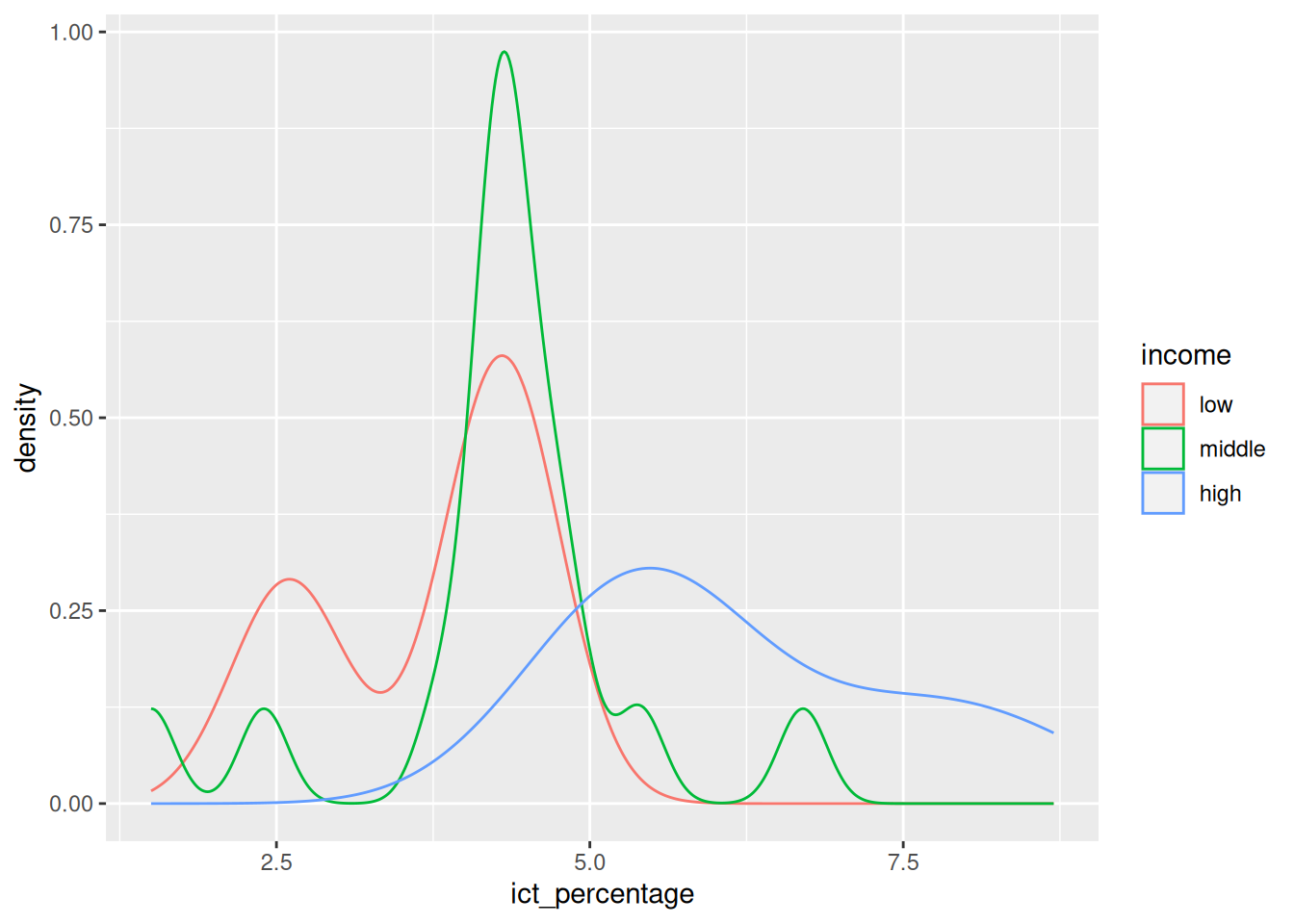
- We can further highlight the plot’s densities by using a
fillaesthetic instead of or alongsidecolor.
Coloring density plots
- We would like to plot the distributions of
ict_percentageperincomegroup.
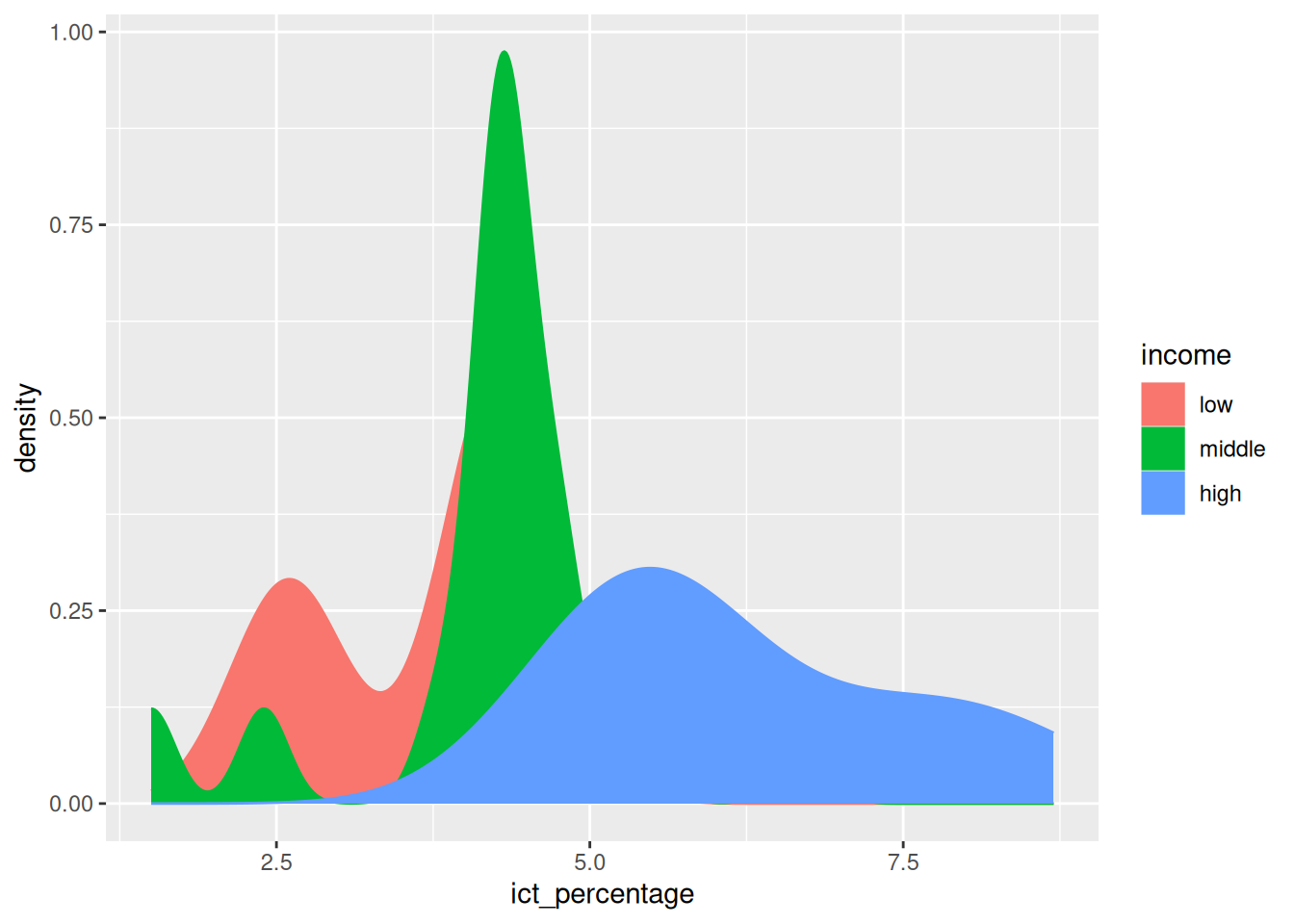
- We can make the plot easier to read by using a
fillaesthetic instead of or alongsidecolor.
- However, with overlapping densities, it is difficult to distinguish the density shape of each group.
Coloring density plots
- We would like to plot the distributions of
ict_percentageperincomegroup.
- We can pass an
alpha(transparency) value to thegeom_density()function to make the plot more readable.
Coloring density plots
- We would like to plot the distributions of
ict_percentageperincomegroup.
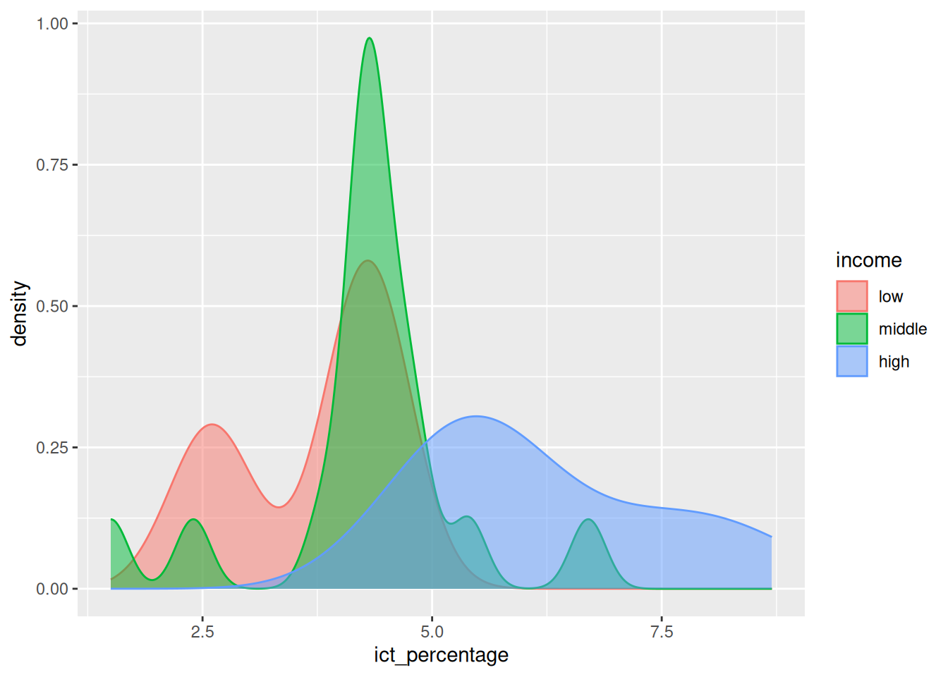
- We can pass an
alpha(transparency) value to thegeom_density()function to make the plot more readable.
- The
alphavalue ranges from 0 (completely transparent) to 1 (completely opaque).
4 A first box plot
- We would like to concisely visualize the basic statistics of
ict_percentageperincomegroup.
- The median, first, and third quartiles are usual statistics of interest.
4.1 Box plots
- We want to concisely visualize the basic statistics of
ict_percentageperincomegroup.
- The box plot is a visualization method that demonstrates the location, spread, skewness, and outliers of a variable.
- Compared to density plots, box plots explicitly display the median, quartiles, and outliers of a variable.
Box plots
- We want to concisely visualize the basic statistics of
ict_percentageperincomegroup.
- The first quartile (or the 25th percentile) is the value below which 25% of the data falls.
- The second quartile (or the median) is the value below which 50% of the data falls.
- The third quartile (or the 75th percentile) is the value below which 75% of the data falls.
- The difference between the first and third quartiles is called the interquartile range (IQR).
Box plots
- We want to concisely visualize the basic statistics of
ict_percentageperincomegroup.
- An outlier is a value that is very different from the remaining values of a variable.
- There are different thresholds to define outliers, e.g., the values outside the 1st and 99th percentiles, but there is no consensus universally applied in every dataset.
- By default, box plots in
ggplot2define outliers as values that are more than 1.5 times the IQR below the first quartile or above the third quartile.
4.2 Visualizing box plots
- We want to concisely visualize the basic statistics of
ict_percentageperincomegroup.
- Creating a box plot in
ggplot2uses thegeom_boxplotfunction. - We need to specify the
xandyaesthetics to define the variables to be plotted.
Visualizing box plots
- We want to concisely visualize the basic statistics of
ict_percentageperincomegroup.
Visualizing box plots
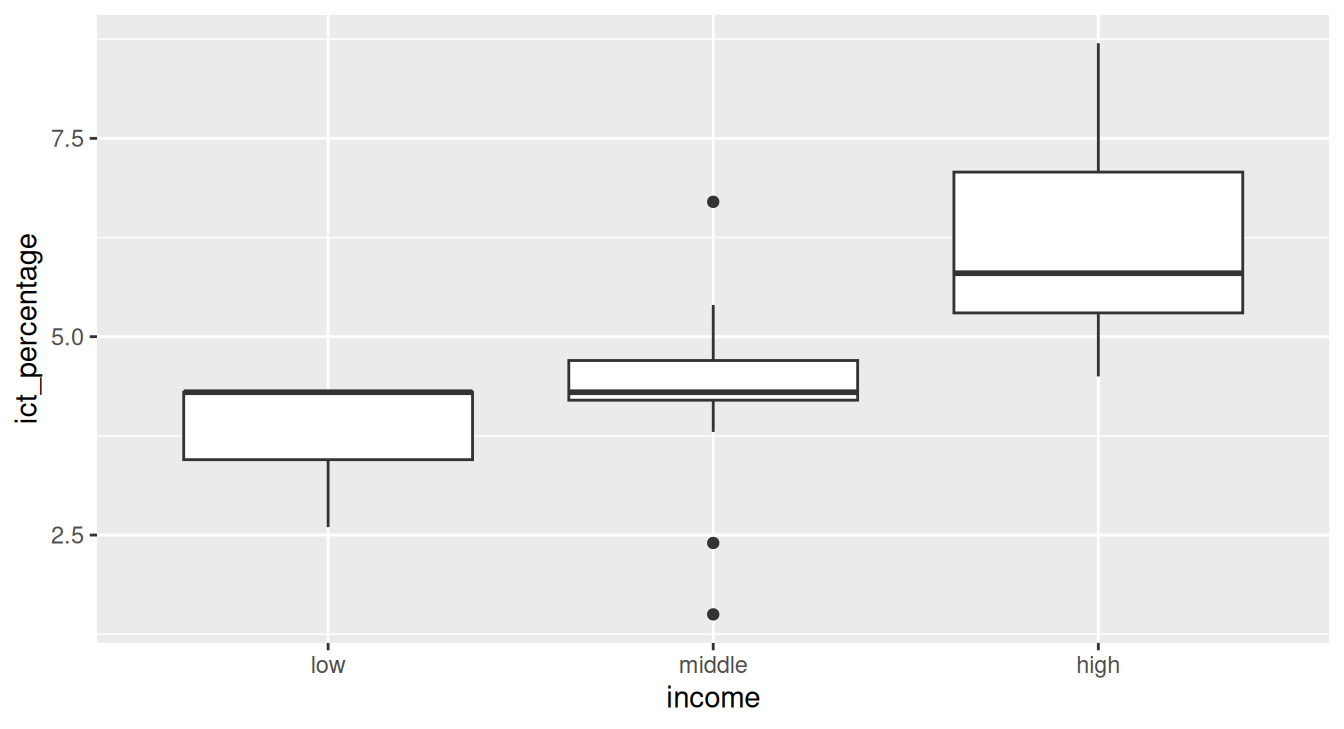
- The median is displayed as a solid horizontal line inside each box.
- The first and third quartiles are displayed as the lower and upper edges of each box.
- Whiskers indicate the range of non-outlier values.
- Outliers are displayed as individual points.
- Skewness is indicated by the position of the median relative to the quartiles.